 |
I added blue lines to demonstrate where to put my text boxes and keep them in line.
To see what my text may look like in regards to layout, font, spacing etc. I used filler text to give me an idea of what it may look like.
I inserted a text box at the top of my screen and made the font larger for my masthead, in a typical masthead position in the layout.
Just beneath my masthead I inserted another text-box in a smaller font for the 'subheading', a typical aspect of a magazine giving a professional overall impression.
I then learnt how to insert an image, this will make my contents page look more interesting and break up the text.
I inserted my first image, after inserting the image to make the page come together more I edited it to 'text wrap' so that the text would wrap around the image, assuring the contents page fits together, giving this togetherness will give a professional look and make the image look as though it belongs.
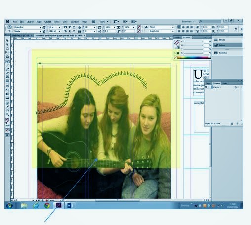
On my double page spread I inserted a larger image, This is a typical element of a double page spread for the image to take up one whole page. After inserting the image I decided I wanted to include a 'pull quote' or maybe place my standfirst on the image so I inserted a text-box and changed the order or my image and text so i sent my image to the back to make the 'pull quote' and standfirst visible.


No comments:
Post a Comment